03: Doodle Maths
Improving teacher sign up form
About
Fun maths apps for children at primary school.

Client goal
Increase teacher sign up conversions and align the design to the website I designed for them.
Design challenge
Teachers are not finishing the sign up process which resulted in inactive accounts. Additionally parents and guardians were trying to use to sign up to gain access. This highlighted the proposition of the form was not clear enough.
Our Process:
As a designer, I started by asking for the analytics. I reviewed at the order of the old form matching it against the insights from the analytics. It was clear we needed to highlight who the form was for. I sinply solved this by adding the question are you a teacher or a parent. I created a very basic wireframe to get some simple ideas down. I created a clearer wireframe to discuss with the developers and stakeholders.

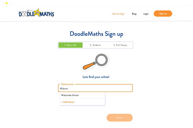
I created a more organised and focused three step process. I made the wireframe clickable in Invision to allow for more constructive client conversations around the new design.

One of the main design improvements was moving the ‘Lets find your school’ screen before teachers could add their personal information. This then became an additional barrier to stop people who are not teachers to continue to try and sign up using the teachers form.

Another fundamental design decision was to make sure teachers doodle accounts where created after their basic information was submitted to reduce inactive account creation.

The visual design cleaned up, made more characterful using illustrations to match the app design and the website I had previously designed for DoodleMaths.


The result
Teachers signing up increased from 36 a week to 200 per week after only going live for a few weeks. There was a reduction in inactive accounts created due the restructuring of the form. User feedback has been positive and matches the friendly usability of the apps.